UIUX Case Study
Develop an app to solve a need
Role: UX, UI Design • UIUX class design project
Problem
“Why is it so difficult to recycle in the United States?”
Americans recycle less compared to other countries.
After some quick secondary research two clear roadblocks emerged.
Problem Statement:
How might we consolidate all the information out there and make it easy,
simple and accessible for residents in the city of Santa Ana, CA.
Research
Brainstorming:
I worked together to develop ideas using different ideation methods. Our collective goal was to create a platform for centralizing information and resources.
We started off with a timed brainstorming session, and gathered all ideas into a miro board
We came up with as many ways as we could think of to showcase and create our information hub
We did some competitive analysis and looked at different recycling websites and apps to see if there were any design patterns to follow. This analysis helped us with our own design choices.
Sketches
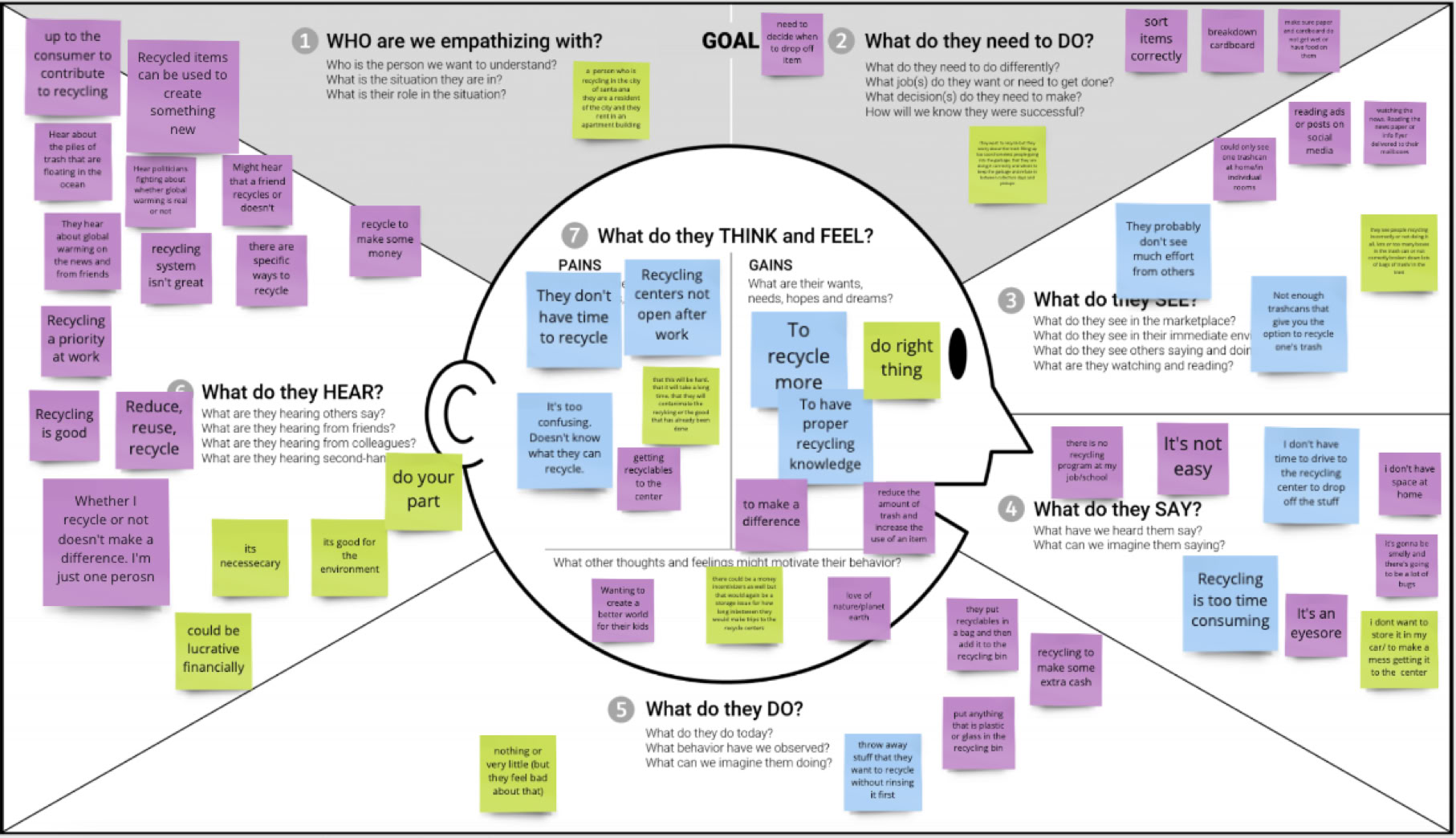
Affinity map
Visual Identity
Usability Testing:
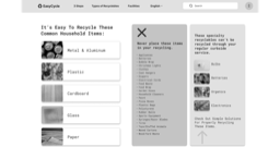
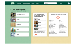
My user testing showed that people liked that it was easy to find what can and can't be placed in your curbside pickup. Only issue was that not everything (like the search bar) was interactive at this stage.
The next step will be to add more functionality and information along with a style guide to help the user obtain their recycling goals.
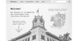
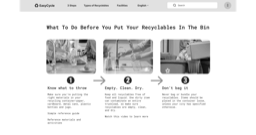
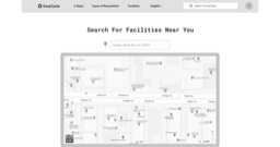
Wireframes I created
Results
Brand logo I created
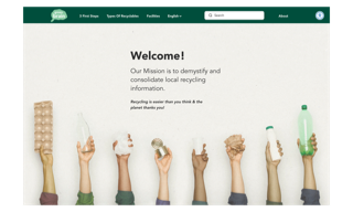
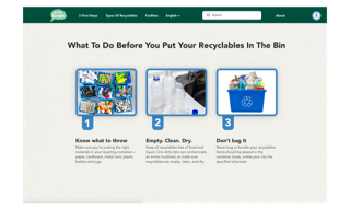
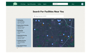
High definition screens I created
What I Learned:
Having an idea to a solution needs research and testing to support or show flaws and possible new directions to pursue. What may sound like a good idea personally may not be best idea for the user. Being open to pivot based on feedback is important.