The non-profit organization Bridge to Connect needed an updated look and consistent branding to stand out in its pursuit of helping students in STEM education.
Original logo
Visual Rebrand Case Study
Rebrand of an existing non-profit organization
Role: UX, Visual Design
Overview
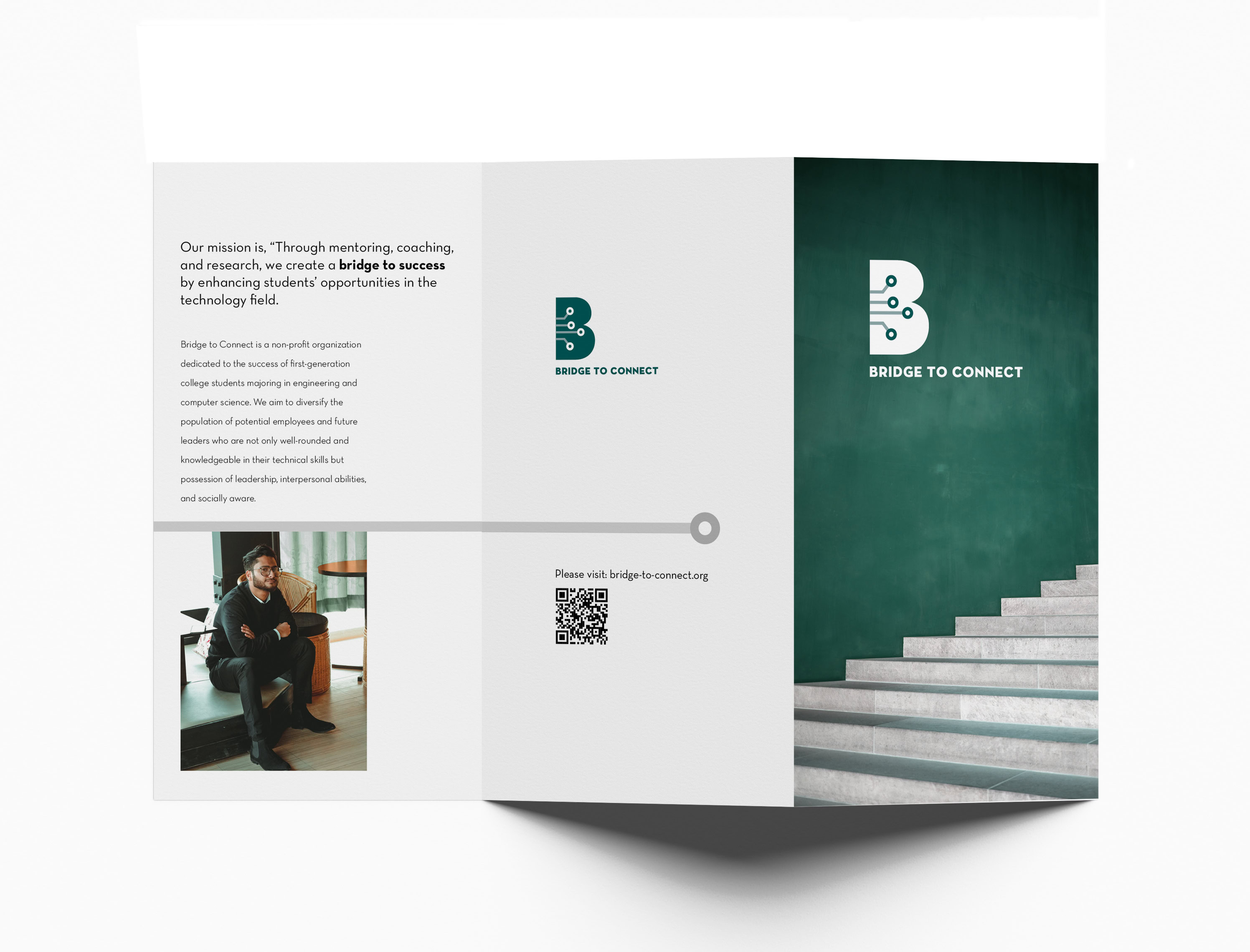
“Through mentoring, coaching, and research,
we create a bridge to success”
Bridge To Connect is a non-profit organization dedicated to the success of first-generation college students majoring in engineering and computer science. We aim to diversify the population of potential employees and future leaders who are not only well-rounded and knowledgeable in their technical skills but possession of leadership, interpersonal abilities, and socially aware.
Problem
The non-profit organization Bridge to Connect needed an updated look and consistent branding to stand out in its pursuit of helping students in STEM education.
Original logo
Research
The research was organized in a FigJam board. Using Figma is a big help in organizing images and text in one handy location.

Site Comparison:
I started by looking at other sites in the comparative area of STEM education. Looking at different companies' logos supports the need to update the current logo.
Next is to gear the rebrand toward the user. The primary users are first-generation students working towards engineering and computer science careers, as well as mentors, industry professionals, and instructors. Current branding is text-heavy and busy.


I searched the web for inspiration from images based on the research to create a mood board.


Logo Evolution
I used Adobe Illustrator to create the new logo.

Initial ideas were inspired by microchips and the connections on circuit boards.

Results


What I Learned:
Research is an important first step, to best know the client. the audience and to provide proof as to why design decisions are made. Feedback is invaluable to fine tuning and stepping out of ones biases. Using grids to better arrange elements and white space.
Keep accessibility in mind when placing type to be careful of text over objects or color.